Aid’s new contours: the distribution of aid to countries and organisations
By Robin Davies
5 April 2016
The first post in this series underlined that while the 28 member countries of the OECD’s Development Assistance Committee (DAC) provided a record $136.5 billion in Official Development Assistance (ODA) in 2014, half of the total was provided by just three countries. It further highlighted that while this total was a modest real increase over the previous year’s, aid from measured non-DAC bilateral sources increased by more than half to $25 billion in 2014. This figure rises to somewhere around $30 billion if one includes estimates of aid from unmeasured sources, such as China. As a result, the total amount of aid available to developing countries actually increased by something like 20% over the two years 2013-14.
This second post examines how the available aid was allocated to the main groupings of developing countries and multilateral organisations in 2014, and discusses trends over time.
The distribution of ODA to developing countries
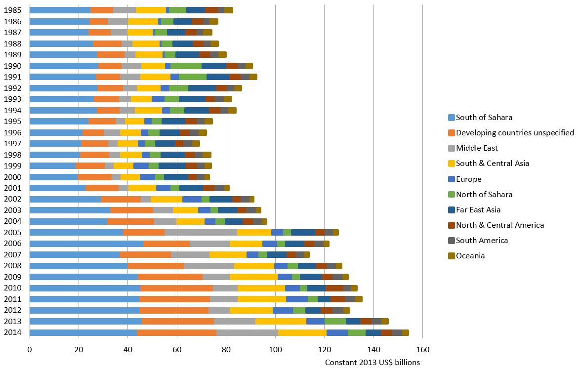
First, let’s look at the geographic allocation of ODA, taking—as per the first post in this series—the recipients’ perspective. The pattern of distribution over time, for aid from DAC bilateral, non-DAC bilateral and multilateral sources, is provided in Figure 1.
Figure 1: Regional distribution of aid receipts

While aid to sub-Saharan Africa still exceeds aid to any other region by a factor of two, it dipped by about $2 billion to $44 billion in 2014.[1] However, it has been oscillating in a fairly narrow band around $45 billion in constant 2013 prices for the past six years or so and it is not possible to read anything into this one-year variation. Aid to South and Central Asia has likewise been oscillating around $20 billion for the past six years and remained at that level in 2014. By contrast, aid to the Middle East, which looked to be settling at around $10 billion in the period 2009 to 2012, jumped to $17 billion in 2013 and then as much again to $25 billion in 2014. Of this, around $15 billion came from two non-DAC bilateral donors, Saudi Arabia and Turkey.
Aid to the mysterious region known as ‘developing countries unspecified’ continued its long-term growth in 2014, reaching $33 billion. Aid in this category now accounts for 28% of all bilateral aid outflows and fully one-third of DAC bilateral aid outflows. Part of this increase, though by no means all of it, is due to the increased reporting of onshore refugee costs by OECD donors, as DAC rules do not allow these costs to be attributed to refugees’ countries of origin. (These costs will be examined more closely in the final post in this series.) A much larger part of the increase appears to be due to increased contributions to geographically unrestricted, specific-purpose funds managed by international organisations, such as thematic funds, which stood at $15.7 billion in 2014.[2]
As for the more minor regions, aid to developing countries in Europe has increased quite substantially since 2007, rising from $5 billion to over $8 billion with a substantial increase in 2014. Aid to North Africa stayed above $7 billion in 2014 after a jump to that level in 2013, owing mainly to large import-finance transfers from the United Arab Emirates to Egypt. Aid to South and Central America has been quite stable at around $4 billion per annum for each of these two sub-regions. Aid to Far East Asia had been following a downward trend from $10 billion in 2002 to a little over $5 billion in 2011, but rose in two of the last three years, reaching a little over $6 billion in 2014. Finally, aid to Oceania, which had been showing a smooth but slowly increasing trend from around $1.5 billion in 2002 to just over $2 billion in 2011, plateaued at that level for two years but in 2014 fell slightly below $2 billion.
Overall, then, we are seeing the most noticeable increases in those regions in which the non-DAC bilateral donors tend to concentrate their aid, the Middle East and North Africa, and also in the ‘region’ in which DAC donors are tending to concentrate their aid, ‘developing countries unspecified’.
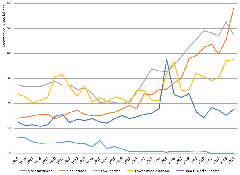
Now let’s look at aid receipts by income grouping. The long-term picture is shown in Figure 2.
Aid to upper-middle income countries continues to oscillate around $18 billion per annum. Aid to lower-middle income countries has grown in each of the last three years but not by much in 2014. Aid to low-income countries has bounced around in the last three years and fell by $5.2 billion in 2014 relative to its 2013 historic high of $52.6 billion. As Owen Barder has pointed out, low-income countries’ share of global aid receipts fell from 35% in 2013 to 30% in 2014. However, it still sits close to its previous highest level, $50 billion, which was reached in 2009. It is also close to the average level achieved over the previous five years, which was $48.5 billion. It should further be noted that a substantial proportion of the fall in 2014 related to a reduction in debt relief claims for Myanmar, which fell from $3.8 billion in 2013 to $1.1 billion in 2014.
Figure 2: Aid receipts by 2014 income category

The most striking change is in the category ‘unallocated by income’. The amount of aid in this category jumped by around $12 billion in a single year in 2014, to just under $60 billion. Its share in global aid receipts jumped from 30% to 36%. This is even greater than the increase noted above in the amount of aid which is not attributed to specific countries. In fact, it is really the same increase except that aid unallocated by income includes aid attributed to specific regions but not to specific countries within those regions. This large increase in aid unallocated by income explains the seeming paradox that, despite the overall growth in aid, the only income grouping to avoid a fall in its share of global aid receipts in 2014 was the upper-middle income grouping, whose share increased just a jot from from 10% to 11%.
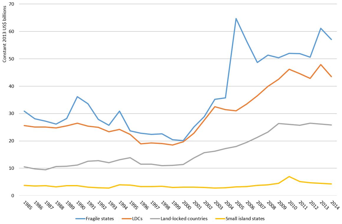
What about the several, overlapping fragility-related groupings? Figure 3 shows the long-term allocation trends for these.
The least-developed country (LDC) grouping now almost entirely contains the low-income country grouping[3], therefore aid to LDCs fell substantially, in fact by $4.5 billion or so, to $43.5 billion. However, as in the case of aid to low-income countries, aid to LDCs was still close to the average level achieved over the previous five years, which was $44.8 billion. Aid to fragile states (defined as those countries appearing on the OECD’s informal list of fragile states) dropped by $4 billion, also reflecting the fall in aid to LDCs, half of which are fragile states. However, this drop followed a $10 billion increase in 2013 and, at $57 billion dollars, aid to fragile states is still close to its second-highest level ever.[4] Aid to landlocked countries stayed flat at about $2.6 billion, as it has been since 2009 after a decade of quite substantial growth. Aid to small island states has been showing a slight declining trend since 2011. This continued in 2014, with receipts falling from $4.5 billion to $4.3 billion.
Figure 3: Aid receipts by fragility category

On the basis of these data, it does not seem possible to substantiate the thesis that aid to the poorest countries is in decline. Yes, aid to low-income countries, and therefore to LDCs and fragile states, did decline in 2014 compared with 2013, but 2013 looks to have been a spike year. Aid to the poorest countries tends to bounce around more than aid to middle-income countries because they are more vulnerable to shocks and their aid is more likely to be drawn from short-term, emergency and humanitarian financing sources. It is prudent to take a medium-term perspective on aid flows in general and to these countries in particular, and to give greater weight to moving averages than to single-year variations. In addition, clearly some non-trivial proportion of the now very large share of aid that is unallocated by region and income will be flowing to low-income countries. Unallocated aid increased by more than aid to low-income countries fell in 2014.
The distribution of aid to multilateral organisations
Finally, let’s take another recipient perspective—that of of multilateral development organisations. Multilateral organisations’ inflows from bilateral donor sources over the past three decades, broken down by the major categories of organisation, are shown in Figure 4.[5] The multilateral development banks and the EC institutions received $14 billion and $13 billion, respectively, in 2014. Other multilateral organisations, outside the UN, received over $8 billion, and their income continued to accelerate as it has since 1998. The main recipients of this funding were the ‘vertical’ funds, most notably the Global Fund to Fight AIDS, Tuberculosis and Malaria.
Figure 4: Aid receipts of multilateral organisations (three-year moving averages)

The UN institutions, by contrast, received only $6.5 billion. Their income has long stagnated at about this level in real terms while funding for other multilateral organisations has substantially increased—by around 50% in real terms over the last few decades. The income of the UN agencies was overtaken by that of the vertical funds in 2011. If one looks at flows of aid from bilateral donors to the main geographic regions and categories of multilateral organisation, in 1985 the UN organisations collectively were the fourth-largest recipient, after sub-Saharan Africa, the multilateral development banks and ‘developing countries, unspecified’. Thirty years on, in 2014, the UN had fallen to 8th position, having been overtaken by the EC institutions, South and Central Asia, the vertical funds and the Middle East.
The third and final post in this series will examine how aid was allocated to sectors and purposes in 2014 and identify some emerging or accelerating allocation trends. It will then conclude by summing up the overall findings of this three-part analysis of 2014 flows.
Robin Davies is the Associate Director of the Development Policy Centre.
This three-part blog series (part one here and part three here) has been compiled into a policy brief titled “Aid’s new contours: an exploration of global aid flows in 2014“.
[1] If one looks only at DAC bilateral aid, flows to sub-Saharan Africa have fallen in each of the last three years.
[2] Contributions to ‘vertical’ funds such as the Global Fund to Fight AIDS, Tuberculosis and Malaria are not included here. They are classed as multilateral aid in DAC statistics. The specific-purpose contributions here referred to are held in trust by multilateral organisations, as for example in the case of the several Climate Investment Funds managed by the World Bank, but classed as bilateral aid.
[3] The only non-LDC low-income countries are the Democratic People’s Republic of Korea, Kenya, Tajikistan and Zimbabwe.
[4] The highest level, $65 billion, was reached in 2005, the year of the Indian Ocean tsunami response.
[5] This includes aid from all measured sources but non-DAC sources contribute quite small amounts of multilateral aid—a total of only $1.3 billion in 2014.
About the author/s
Robin Davies
Robin Davies is an Honorary Professor at the ANU’s Crawford School of Public Policy and an editor of the Devpolicy Blog. He headed the Indo-Pacific Centre for Health Security and later the Global Health Division at Australia’s Department of Foreign Affairs and Trade (DFAT) from 2017 until early 2023 and worked in senior roles at AusAID until 2012, with postings in Paris and Jakarta. From 2013 to 2017, he was the Associate Director of the Development Policy Centre.
